Always use the formatting tool to set the font style.
Heading 1: Page Titles, Homepage section titles
Heading 2: Banner image headline
Heading 3: Banner sub-headline, Body tertiary headline, or page with a lot of media can use this as a header instead.
Heading 4: Secondary headlines (Homepage and body), Accordion menu headlines, Form Headers, Class detail sidebar items
Heading 5: Body primary headline
Heading 6: Stay Connected box, Call-out text
Normal
Normal BOLD
Normal Italics (don't work)
- Bulleted Text with no format. When you add bullets, the format selection disappears.
Normal Text with the quotation mark WYSIWYG button. Great for indenting information in a block to make it stand out
Buttons
PrimarySecondarySuccessDangerWarningInfoLightDarkLink
Formatting Guidelines
- Image Rules:
-
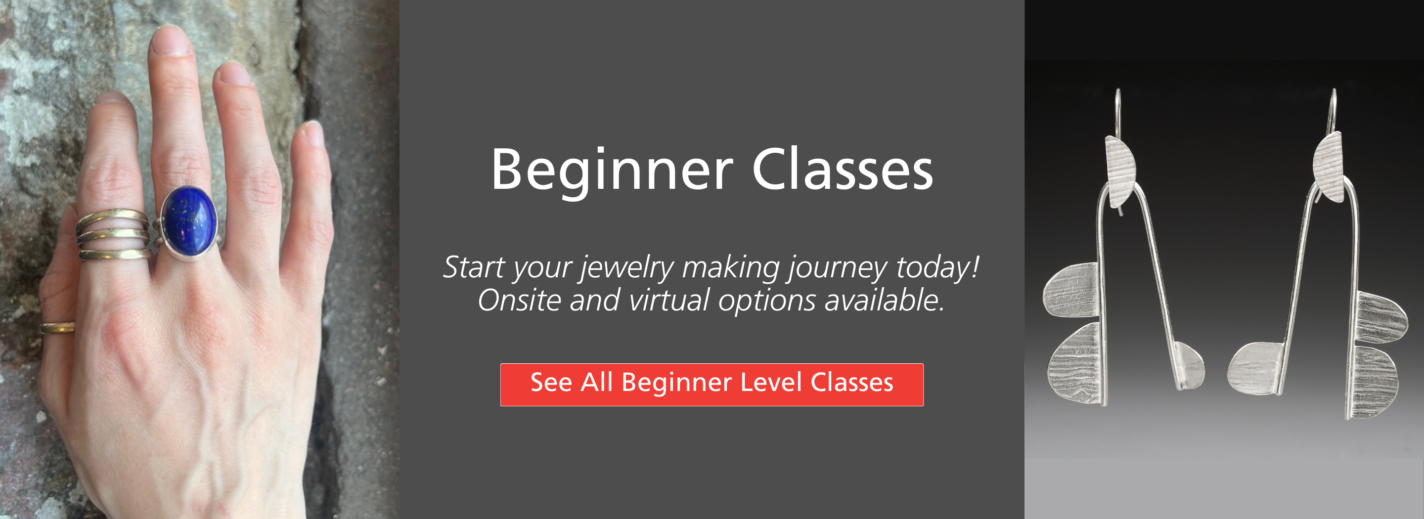
- Full Width Banner is an image cropped to 2880 x 700 px. It will resize on mobile/be responsive by cropping.
- Images in Feature Boxes are 450 x 330 Horizontal
- If you want to use square images, 450 x 450 px. Use sparingly so we're consistent.
- Feature Block Rules
-
- Use on landing pages, as though it's phone navigation.
- Only use with header, link, and image. No Body Text.
- Landing Page Rules
-
- Short narrative
- Banner
- Feature Blocks: Limited to 9 (3 rows of 3)
Landing Pages
- Student Info (dropdown menu)
- Studio (main navigation)
- Resources (main navigation)
- About (main navigation)
Special Landing Pages (doesn't follow the landing page rule, but some combination)
- Events
- Spring Symposium
- Accordion Menu Rules
-
Use them when a page has:
- More than 4 different lists or content sections that might not apply to everyone reading the page
- More than 2 different lists or content sections that are REALLY LONG
- Really it’s about: what is the goal of the page? Is there information that everyone visiting that page needs or should read. Example: we don’t need folks to read only PART of the Covid policy. We need them to read all of it. Basically: Do you want to let the web visitor decide which content they should read OR do you want to decide?
- Links for Filtered Class Views
-
We can link to filtered views for different class types in newsletters. and feature blocks/buttons throughout the site. The URL's are:
Basic Page Layout Heading (H1)
Primary Headline (H5)
Normal: Body Text. Lorem ipsum dolor sit amet, consectetur adipiscing elit, sed do eiusmod tempor incididunt ut labore et dolore magna aliqua. Ut enim ad minim veniam, quis nostrud exercitation ullamco laboris nisi ut aliquip ex ea commodo consequat. Duis aute irure dolor in reprehenderit in voluptate velit esse cillum dolore eu fugiat nulla pariatur. Excepteur sint occaecat cupidatat non proident, sunt in culpa qui officia deserunt mollit anim id est laborum.
Secondary Headline (H4)
Normal: Body Text. Lorem ipsum dolor sit amet, consectetur adipiscing elit, sed do eiusmod tempor incididunt ut labore et dolore magna aliqua. Ut enim ad minim veniam, quis nostrud exercitation ullamco laboris nisi ut aliquip ex ea commodo consequat. Duis aute irure dolor in reprehenderit in voluptate velit esse cillum dolore eu fugiat nulla pariatur. Excepteur sint occaecat cupidatat non proident, sunt in culpa qui officia deserunt mollit anim id est laborum.
Tertiary Headline (H3)
Normal: Body Text. Lorem ipsum dolor sit amet, consectetur adipiscing elit, sed do eiusmod tempor incididunt ut labore et dolore magna aliqua. Ut enim ad minim veniam, quis nostrud exercitation ullamco laboris nisi ut aliquip ex ea commodo consequat. Duis aute irure dolor in reprehenderit in voluptate velit esse cillum dolore eu fugiat nulla pariatur. Excepteur sint occaecat cupidatat non proident, sunt in culpa qui officia deserunt mollit anim id est laborum.
Image or Button could go here
This section is a way to grab attention!
Configured:
- Two column full width section. 25% / 75% view on Desktop and Tablet.
- The background color should be set to light rose, light blue, or light grey.
- The animation is set to FADE UP.
- Basic blocks can be inserted for the content.
Feature Boxes Template (Skvare Custom Block)

Single Feature Block Template (Skvare Custom Block)

CTA Feature Box Ideas to consider
Add Custom Block > Basic Block > Edit content as well as style (borders, background)
Box 1 (H5)
Lorem ipsum dolor sit amet, consectetur adipiscing elit, sed do eiusmod tempor incididunt ut labore et dolore magna aliqua.
Box 2 (H4)
Lorem ipsum dolor sit amet, consectetur adipiscing elit, sed do eiusmod tempor incididunt ut labore et dolore magna aliqua.
Box 3 H6
Ut enim ad minim veniam, quis nostrud exercitation ullamco laboris nisi ut aliquip ex ea commodo consequat.
Box 4 (H5)
Lorem ipsum dolor sit amet, consectetur adipiscing elit, sed do eiusmod tempor incididunt ut labore et dolore magna aliqua.
Box 5 (H4)
Lorem ipsum dolor sit amet, consectetur adipiscing elit, sed do eiusmod tempor incididunt ut labore et dolore magna aliqua.
Box 6 (H6)
Ut enim ad minim veniam, quis nostrud exercitation ullamco laboris nisi ut aliquip ex ea commodo consequat.